Design / Monday March 2, 2026
8 Stunning Website Designs for Your Freelance Website

A breathtaking website is probably the first thing a modern freelancer has to take care of before heading out looking for gigs. Done right and with taste, your website will help you convert a significantly higher percentage of your leads, as they will have access to your portfolio, see some testimonials, and know precisely what you can and can’t do.
Unfortunately, freelance businesses are often underfunded side projects that we wish would one day be big enough to support us. This means freelancers do everything on their own.
Thankfully, there are some great tools along the way that can help you build astounding websites. Still, if you are not a designer, you might find it challenging to envision what your website should look like. You might be a great developer and an astounding content writer, but you can still mess up the visual aspects of your website.
So, today, we’ve picked our eight favorite freelance websites to inspire your freelance website design.
1. Sam Underwood

We will start with Sam Underwood’s pragmatic and straightforward design. The website is a classical landing page, offering a stunning customer journey. The content itself is top-notch, and the color scheme emits power and elegance. Sam’s website is a masterclass of visual hierarchy. Notice how he underlines his service niche in orange. Orange, the color of power and confidence, not only grabs the user’s attention but also redirects it to the CTA (in the same color).
The Hero section is not the only brilliant maneuver here. You can see the authority proof below, followed by the offer. The About section is skillfully done, using a few bullet points to provide all relevant information to potential customers.
The homepage finishes with a great social proof section, blog posts, and a CTA. The testimonials are accompanied by relevant statistics, such as a 104% 12-month average traffic increase and only 5 projects simultaneously. Though this may seem useless to share at this point, it effectively says, “I’m brilliant and in demand. Hurry up, or you will miss out.”
The CTA is also brilliant. It almost blends with the website, yet you can’t miss it. Usually, designers prefer to make the CTA stand out like a sore thumb. But in this case, Sam uses the same colors. A bold move but definitely a successful one.
The menu is also pretty standard. It offers an in-depth look at the services, the person, and what resources he uses. The “Favorite books” subsection is a nice touch that gives a glimpse of something more personal. This is an effective way to create a deeper relationship with your audience without even talking to them. Of course, you don’t have to share your favorite books or movies. You can go with your hobbies or other information you deem exciting and personal.
2. Surinder Thakur
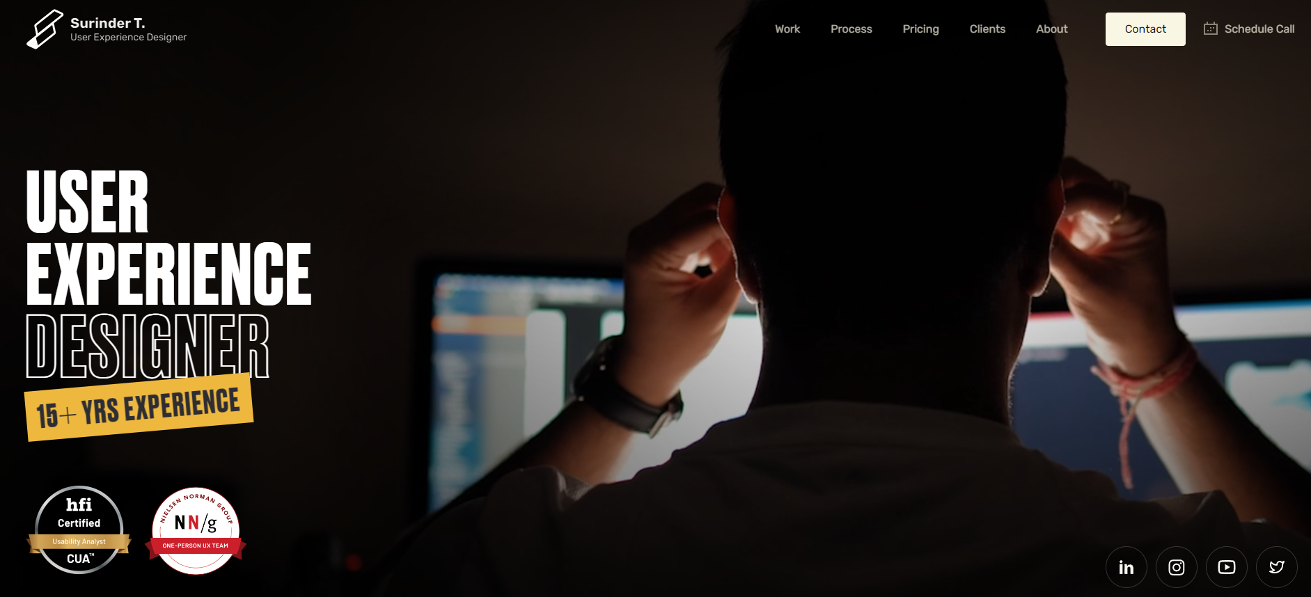
We’ve already spoken about video heroes and their benefits. When it comes to freelancers, this is quite a bold move, but Surinder Thakur nails it. But what can you expect – the guy is a professional user experience designer.
The video in the hero section actually shows Surinder working, which is nothing groundbreaking, but it captures attention. To the right, the H1 title states precisely what Surinder does and includes some proof of authority (certificates). The lack of a CTA in the Hero is notable, but this section is just the beginning of the customer journey. Though the copy provides enough information (what Surinder does and what experience and credentials he has), at this point a lead will rarely be ready to convert.
So, right after the Hero, there is the offer, followed by another authority proof.
One thing Surinder did that Sam didn’t is the benefits section. The UX designer built it quite skillfully, grabbing attention by addressing his target audience’s pain points and illustrating them with real-life projects. This works as both social proof and benefits, and as portfolio and authority proof. To emphasize his clients’ satisfaction, he added video testimonials.
Another lovely touch is the process page, where Surinder explains his approach to work and how he tackles each task. It gives a good vibe of how the expert will handle your project.
Surinder’s website is a master class in UX, and it’s easy to see that every step of his customer journey was well thought out and planned. Naturally, there are several CTA’s along the way. Can you spot them…? That’s right. They are all bright red, demanding attention, utilizing the color’s power.
Of course, the CTA doesn’t have to be red, but a sharp, vastly different color will always draw attention. You can learn more about that here.
3. Bazil

Bazil’s website is a genuine masterpiece and should be in textbooks for freelancers offering two different services. Now, some experts suggest creating two different websites for your services, as they target different audiences. Bazil, however, found a way to mix both and use his name as a brand.
The web designer/photographer’s website is quite minimalistic. His homepage is nothing more than a separator. Still, it’s entertaining and visually pleasing, offering fast and easy access to whatever service you are after. Our only reservations are about the introduction line, especially the emoji, as it doesn’t fit the website’s overall aesthetic. This entire sentence doesn’t give any valuable information, and the waving hand only distracts the audience from the important bits. Still, it’s a minor flaw.
The homepage also offers the freelancer’s location, which is essential if you are looking for a photographer. The homepage is completed with a small authority proof in the lower right corner.
Each of Bazil’s two services has its own web page. They follow a different structure, which is unsurprising, considering both audiences have different needs. The designer page highlights a powerful title and a CTA. Next, there is authoritative proof and some samples. The real deal, however, is below, where Bazil does an outstanding job of highlighting his unique sales proposition.
The Photographer page is mainly a portfolio with a lot of pictures on the right. On the left is a powerful H1, a persuasive H2 highlighting the unique selling proposition, and a CTA.
Bazil’s website is the perfect example of how you can effectively combine two services under one roof. This practice will build your brand (i.e., your name) as a multi-service platform. This will give you enormous leverage, especially if your services complement each other.
4. Crisp Copy

Speaking of minimalist designs, Crisp Copy’s website is on the other end of the spectrum. Usually, maximalist web designs are frowned upon, but Jay Crisp Crow does it to perfection. The website is flamboyant, powerful, and gorgeous. But more importantly, it is a masterclass in the power of words.
Typically, modern websites avoid words. That’s natural, as people don’t really like to read, especially when they need a fast solution to their problem. This is where Jay’s genius kicks in. As she offers copywriting and copy coaching, Jay uses only words and pictures to craft an astounding customer journey. Her start is sharp and dazzling, preparing the audience for what’s to come. In fact, this is a valid strategy if you are working in a tight niche and want to separate those looking for something else early on. This way, you won’t have to waste time and energy communicating with people who are not interested in your offer.
So, starting with “Get Crisp, the world has enough stale copy” is simultaneously a powerful call to action and a representation of the unique sales proposition. This sales proposition is supported immediately by testimonials (i.e., social proof).
The entire website is one infectious journey, where each segment represents the classical landing page structure in a unique way. Unlike the previous website, this one has a lot to read, but its flow makes it effortless. The Website, as a whole, is one continuous story about how you can solve your problems, and it’s quite fitting for someone offering words as a service.
So, when you build your website, consider how to incorporate your service into the design and how best to showcase your skills.
5. Chungi Yoo
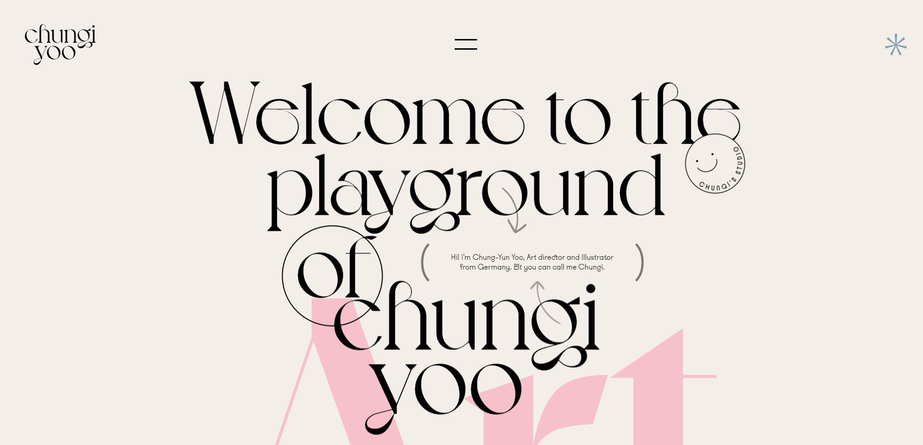
With Chungi Yoo, we enter a series of slightly more complex websites that require some design knowledge. Still, they offer a great example of how to create a customer journey and a website flow. So, even with no designer aspirations or expertise, you can still take a page out of this art director and illustrator’s book.
The website is a bit overwhelming, and the design takes all your visual senses by storm. Though very risky, Chung-Yun built an effective journey that fully represents what her clients may expect.
The short, almost hidden, introduction is a nice touch that gives you a sneak peek of who is behind this madness.
Also, calling it “Playground” is definitely the right choice, as it prepares the audience for what’s to come. The entire website is like a designer’s jam session with no hold bars. Thus, the website is effectively the perfect portfolio.
Scrolling down lets you learn more about the freelancer, their hobbies, and their drives. The point is to build a closer relationship with the audience and make them feel like personal guests rather than being in a store.
This website is hard to describe. It needs to be experienced. Still, if you are feeling inspired and you also want to go for an overwhelming design, make sure to do it tastefully and follow Chung-Yun’s lead.
6. Oskar Koli
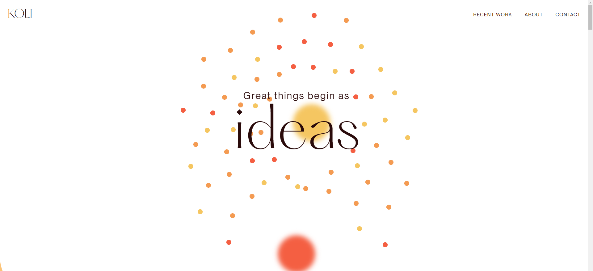
When it comes to website flow, you can rarely find a better example than Oskar Koli’s website. The creative developer has built an astounding minimalistic website that flows like a river. The balls that form in the header and fall down naturally draw your attention downwards, so you feel compelled to scroll down. The balls actually lead you throughout your journey, showcasing the main work process and its similarities with what you actually need.
The site is anything but a traditional freelancer online home, as it doesn’t have a Hero and doesn’t showcase authority proof or social proof. It relies entirely on visual persuasion. The only additions to this online business card are a short portfolio and the About page.
This website is a genuine masterpiece and an example of how less can give you more when done properly. Of course, this is a risky move, but if successful, it will set you apart from the pack and surely make the audience at least check out your website. This is more than can be said for some sterile, boring websites out there.
7. Bruno Simon

Now, if you are a web developer or designer, you might want to stretch your creativity a bit further. After all, a boring, regular website may bring in the masses, but a fun website will keep them in and encourage them to look around. Bruno Simon’s website is an outstanding example. It’s essentially a flash game where you control a small car that smashes through various website elements. The website is like nothing you’ve seen before, and looking around is quite enticing. There is an information section, a portfolio section, and a playground section.
Once you’ve spent some time on the website, a small avatar will appear in the lower-right corner and ask if you want to learn how to do that. This push CTA is a great way to capture the initial enthusiasm while the user is still playing around and not actually looking at your portfolio.
Now, you don’t have to build a website as complicated as this one. All you need to do is be original and entertaining while showcasing your capabilities. This way, while the users marvel at your work, you can invite them to get in touch. Fun and positive emotions are precisely what you want to be associated with.
So, take some notes from Bruno Simon and make your website a museum of your capabilities.
8. Arthur Engel
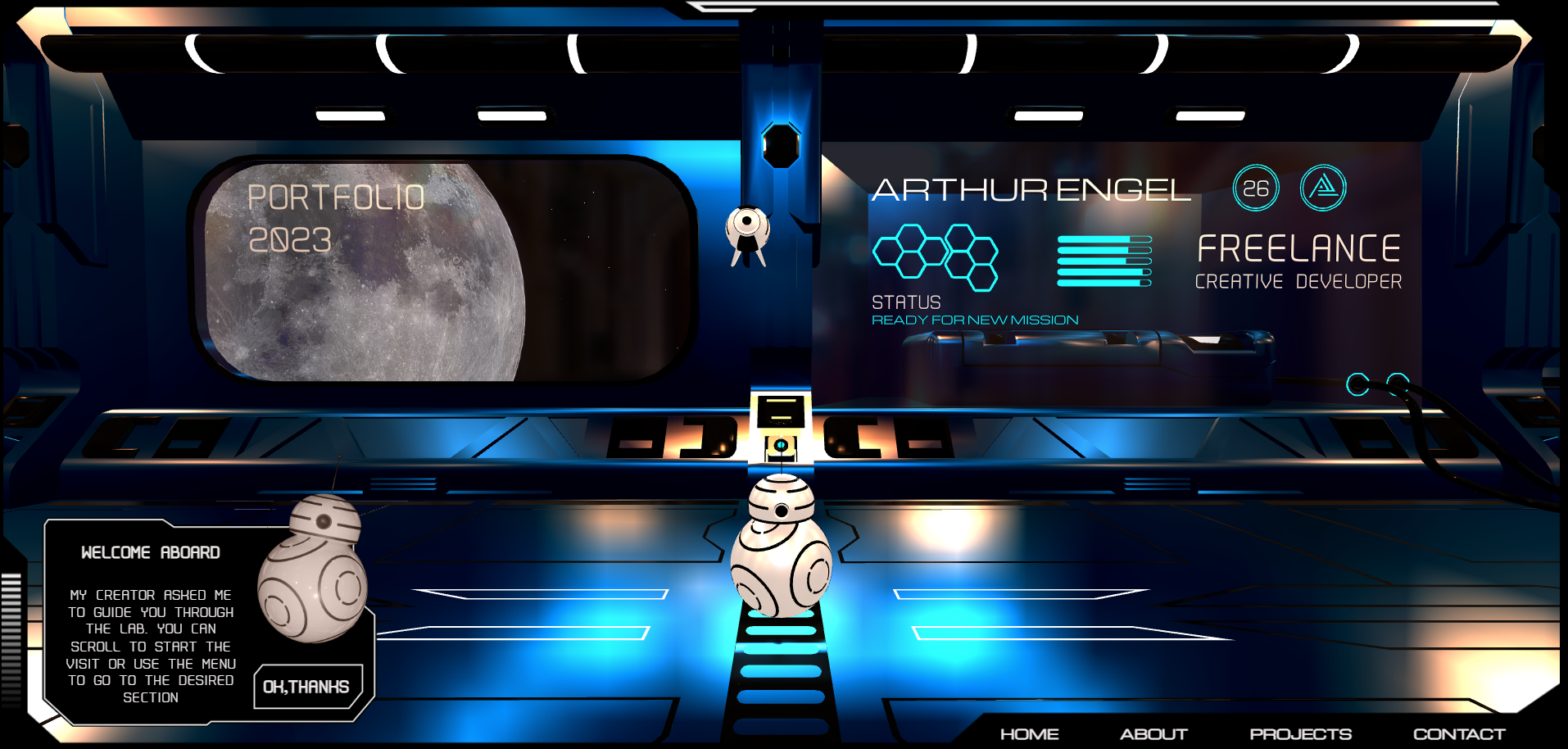
Arthur Engel had the same idea, though he did it a bit more straightforwardly. Still, his portfolio is nothing short of mesmerizing. The website itself has drawn inspiration from some of the greatest works of sci-fi art—Star Wars and StarCraft. With your scroll, you essentially control a BB-8 replica, while at the same time, your mouse controls a StarCraft observer. While both are rolling through a spaceship, you can see different information about Arthur.
Like Bruno, Arthur’s main goal is to showcase your capabilities with your website. If you are a creative developer, it stands to reason that your best work should be the one presenting your business.
This, however, applies to every niche. Your website may be a bit more boring if you are a content or copywriter, but it still has to showcase impeccable grammar, wit, and writing skills. If you are a photographer, you have to upload your best pictures.
Despite the fascinating design and customer journey, Arthur’s website is actually pretty minimalistic. He doesn’t bother to show authority or social proof. He doesn’t even have a proper Call to Action. Actually, there is even a mistake in his CTA. So, don’t take this example at face value. It’s obvious that Arthur is not an English speaker. Still, if you are going to advertise yourself in English, your content must be impeccable. The whole idea behind the website is to show his capabilities. Thus, there are a few words, a short About section, several projects, and a contact section. However, users are enticed to follow BB-8 and the observer on their journey. Arthur’s website is truly a creative designer’s dreamland and can give you an idea or two for how to lay out your own website if you are in a similar field.
Some Final Thoughts
If you are wise, you won’t try to replicate this website as it is. Sure, they work great for the particular freelancer, but being innovative and clever in your web design is far more important. Try to utilize your strengths and your unique sales proposition. Make sure to take note of each of these websites and their strengths.
Still, for any website to work, it needs fast, secure, and reliable web hosting. That’s where HostArmada can make the difference between success and oblivion. We offer lightning-fast, robustly secured, and impeccably reliable hosting services. Our services will not only guarantee that your audience will always find your website, but it will also load for a fraction of a second, enhancing your SEO score and overall user experience.
Note that websites such as Bruno’s and Arthur’s are highly demanding, and if you compromise on your website’s infrastructure, they will neither look good nor load fast enough to achieve the wow effect they have.
So, check out our plans, get some inspiration from the websites we shared, and let’s make your freelance online home a dream house.
FAQs
A strong freelance website should include a clear value proposition, portfolio samples, client testimonials, a services page, an about section, and a simple contact method. Optional additions like pricing packages, case studies, and a blog can further build credibility.
Choose a design that reflects your industry and personal brand. Designers may prefer visually bold layouts, while writers or consultants may benefit from clean, content-focused designs. Prioritize clarity, fast loading speed, and easy navigation.
No. Platforms like WordPress, combined with drag-and-drop builders and pre-designed templates, allow freelancers to create professional websites without coding knowledge.
Focus on showcasing real results, clearly explaining your services, optimizing for SEO, and including strong calls-to-action. Make it easy for potential clients to understand what you offer and how to get in touch.