Emails / Friday February 6, 2026
How To Create an Email Design That Will Boost Your CTR

Email design plays a critical role in improving click-through rates. Layout, visual hierarchy, readability, and call-to-action placement all influence how subscribers interact with an email and whether they decide to click.
Optimizing these elements doesn’t require complex design skills or flashy visuals. Small, intentional design choices (especially those focused on clarity, mobile usability, and user experience) can significantly improve engagement and CTR.
In this article, we’ll cover essential email design practices to drive more clicks, focusing on structure, visuals, and usability improvements that work across devices and email clients.
1. Always Stay On Brand
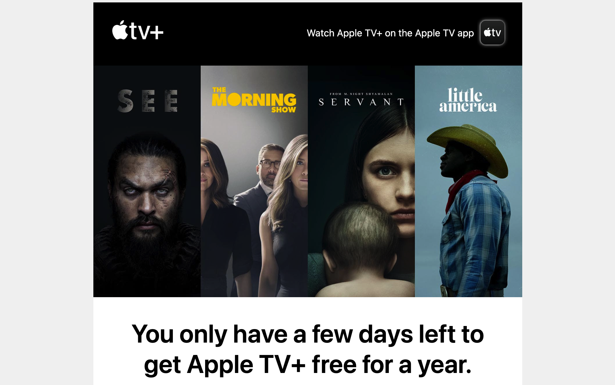
Every email you send must scream your brand. It must be instantly recognizable, and users must be able to tell who sent it at a very first glance. Consistent branding will give your email an enormous credibility boost. Recognizable logos, fonts, colors, and styles will capture a user’s attention far before any copy. By branding your email, you will watermark your messages, essentially saying, “Yes, that’s us.” This step also prevents scammers from using your name and brand to extract money. This is especially true if you have unique fonts and typography that are hard to find.
So, by enhancing the user’s trust in your email, you increase the likelihood that they will follow your CTA. It also stands out from the vast amount of spam and unwanted newsletters, so the user will instantly recognize this email and what it is most likely about.
For example, if you send your subscribers a special offer each Wednesday, they will instantly know what the email is about just by seeing your brand. Thus, their brains will release dopamine, making their association with your brand more pleasant. Naturally, this will lead to more purchases.
To meet the demand, you need to create a master template. This way, your email will have the same aesthetics, fonts, sizes, and general placement. Since you will be sending more than one type of email, it’s wise to have a few of these templates—at least one for each type. That way, you will drastically reduce the time spent creating your email from scratch. But more importantly, you will be able to maintain the all-important consistency.
2. Use The Design To Highlight Pain Points
Now, brand personality is essential, but since email is a marketing tool, you have to focus on what your audience cares about. Email design can help you significantly in this direction.
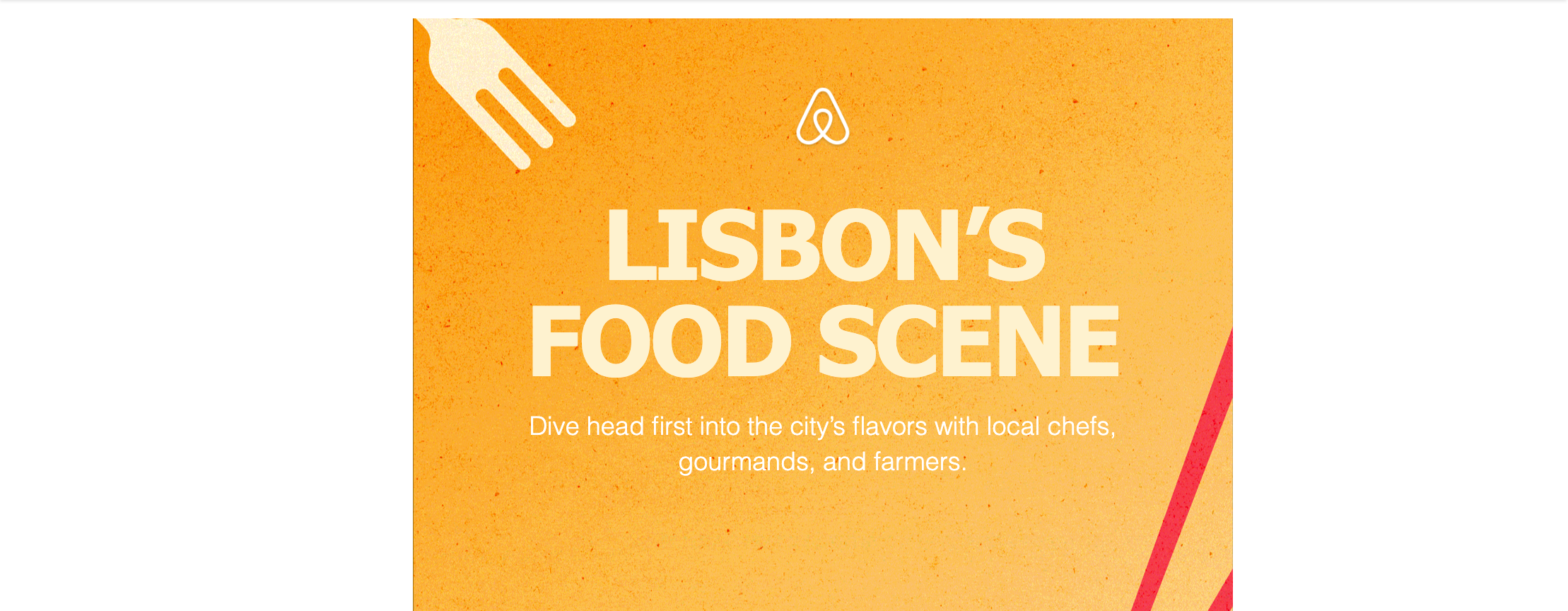
So, while placing your logo in the header is a great idea, the email headline should focus on a specific benefit the reader will receive if they follow the CTA.
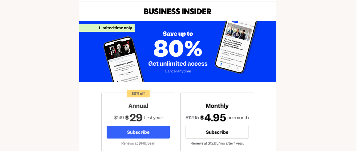
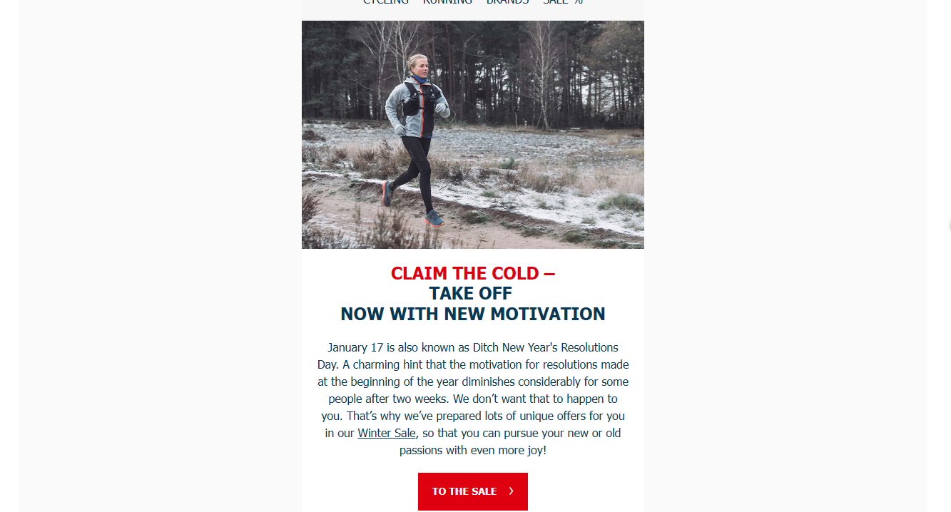
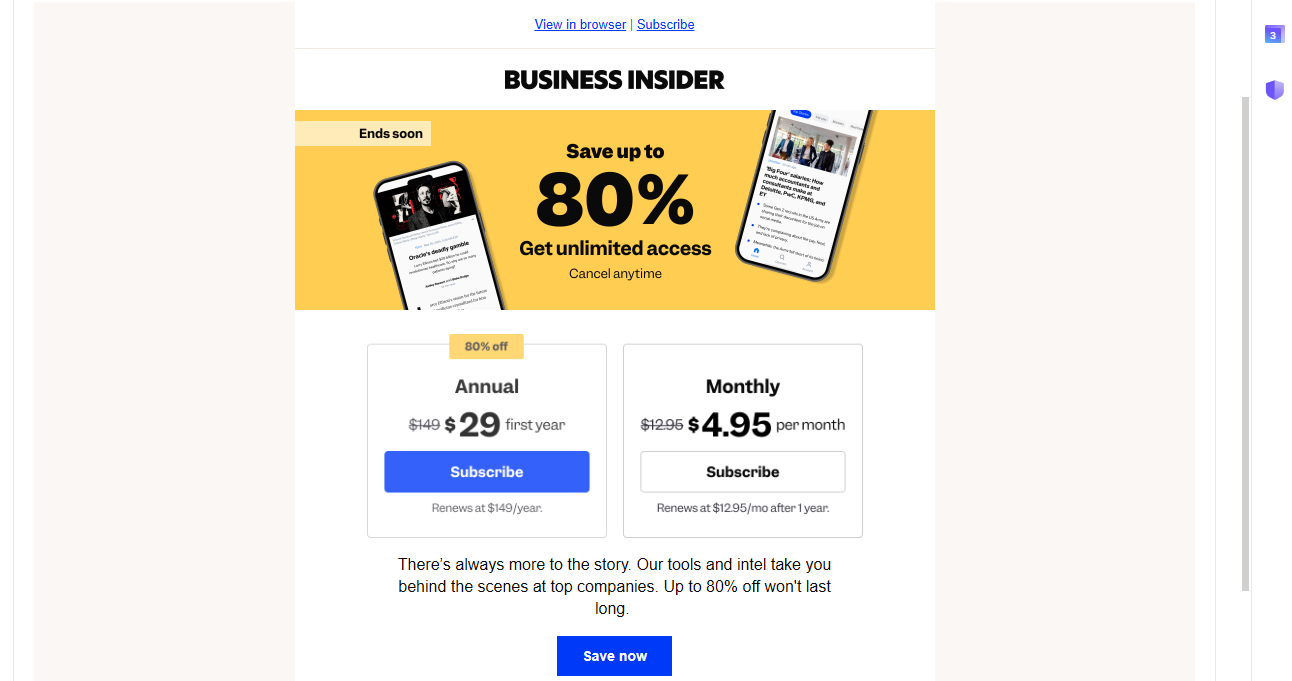
Take, for example, this email from Business Insider:
The logo is in the header, making the branding visible but unobtrusive. Then the headline instantly captures your attention. The giant 80% instantly gives you an idea of what to expect. The subheadings also list benefits. As you can see, “cancel anytime” is a regular text. That’s because the sender doesn’t want you to focus on the fact that you can quit. Yes, it’s there, but don’t think about it.
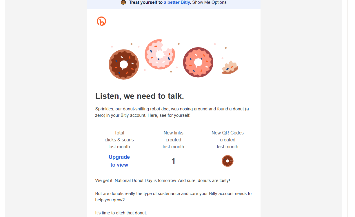
Then there is this Bitly email:
The headline is not what you, as a customer, need but rather what they want. Moreover, such a headline can bring anxiety, as it can bring back memories of your parents sitting you down for a talk.
So, naturally, the Business Insider will have much better results, as people will at least hear them out.
3. Remember, There Are Dark And Light Modes
When creating your template, remember that users can choose either dark or light modes on their devices. This means your email should accommodate both options. Now, some platforms allow you to create both options, and the user can choose which one to see. However, your goal is not to make additional steps for the recipient. So, ensuring your email design looks equally good in light and dark mode is far better.
So, consider a neutral background color that perfectly represents your brand. We strongly recommend against using white for your background. Sure, it will do the trick, but at the same time, it’s way too aggressive when the user deliberately chooses dark mode. Your email, gouging his eyes out with its whiteness, will force the user into a defensive posture. This will reduce the likelihood of reading the email. If that’s a repeated offense, the user will unsubscribe. So stick to soft, pleasant colors that represent your brand.
4. Follow Accessibility Best Practices
Now, when it comes to emails, you need to make them as accessible as possible. This way, you can tap into an audience that most brands regularly ignore. Following basic best practices will not only expand your outreach but also ensure that underprivileged groups that often remain outside the market reach your email content.
Naturally, showcasing your commitment to helping them be a part of your community will be greatly appreciated. Moreover, it will lead to an immediate increase in CTR, as a brand that goes to the trouble of making its emails accessible will likely have done the same for its website.
So, there are a few things you should stick to.
First and foremost, make sure to add alt text to all images. Furthermore, stick to short, descriptive subject lines and preview texts, and ensure all important information is outside the pictures. This will help people with impaired vision understand what the email is about.
Furthermore, use contrasting colors and ensure your section headers are large and easy to read. This way, people with difficulties will receive your message loud and clear.
5. Responsiveness Is Everything
With 75% of people sharing that they check their email on the go, it’s obvious that mobile-friendly email designs will yield much better results. Luckily, most email design tools offer an instant mobile conversion, so you don’t have to worry too much about coding. Still, there are a few things that you need to consider.
First and foremost, you must align your subject and preview text with mobile inbox requirements. While the desktop version allows up to 60 characters (spaces included), mobile email inboxes typically limit it to 30-35 characters to ensure your subject line is fully visible on every smartphone.
Next, make sure your email is in a single column. This is the most efficient way to ensure the reader sees all the intended information.
Then, there is the size of the copy. The subheadings should be at least 22 points, while the regular text should be at least 14 points. This way, the readers will be able to receive the message much more clearly and without hassle. Something more. Many would just close the email entirely if they had to zoom in or strain to read it.
So, making sure mobile users can read your email easily and comfortably will increase the percentage who actually click the CTA.
Of course, if you want your conversion rate to increase as well, you have to ensure your web design is just as responsive and accommodating for mobile users.
6. Use Visual Hierarchy
The visual hierarchy will help you establish a customer journey and effectively focus the reader’s attention on the most important elements of the email. This will significantly improve the email’s readability. More importantly, it will increase the message’s scanability without sacrificing important information. Users often take a quick look at an email without reading it in full. So, if you create a visual hierarchy, their eyes will instinctively follow the path you intended, making it far more likely they will click the CTA.
How to Create Visual Hierarchy
So, how do we create this hierarchy? Well, for emails, there are two main ways to do it:
- First, make sure to use appropriate font sizes and high-contrast colors so the most important parts of your message stand out.
- Then, integrate the Z or inverted pyramid layout.
Users, at least most of them, are easily predictable when it comes to how they will read a particular email. In Western society, we read from left to right and from top to bottom. So that’s how every single user scans any content. Emails are no different. So, using the Z or zig-zag layout will allow you to keep the reader’s attention to the end of the email.
However, make sure to add interesting elements or information throughout the copy in strategic places. For example, on the right corner, right before the fold, you must place something important to rehook the reader. Often, users will jump right to the end of whatever is on the screen to see how it ends. So, if you want to keep them interested, here is your chance.
Then, there is the inverted pyramid layout. This one is by far the most popular. The idea is to grab the reader’s attention at the very top and draw them down slowly, focusing their attention by narrowing the content’s width. Usually, the CTA button is at the bottom of this funnel.
These are the two patterns that work most effectively on emails. Still, you must apply more aspects of the visual hierarchy to increase your CTR even further.
7. Use The Design To Personalize
One of the biggest advantages of email marketing is the ability to personalize the content. You already have significant and valuable data on the recipients. So, make sure to utilize it to attract their attention. Your email design should take a leading role in this endeavor.
Of course, to personalize the design, you need to have clearly segmented email receivers. So, make sure to put the subscribers in relevant groups. For example, those who bought a product should be in one segment, and those at the top of the funnel must be in another. The same goes for people in New York and those in Texas.
The most valuable segmentation, however, is zero-party information – the one that users give you personally in surveys, quizzes, and on-site forms.
Once you’ve divided your subscribers into groups, it’s time to create different templates for each group.
When it comes to design, the level of personalization depends on the segment you are targeting. For example, if you’re sending an email to people who have already bought a product, you might want to remind them they already have it and that other products will complement it. On the other hand, this information is irrelevant to people at the top of the funnel, so you must hide it. Luckily, most email builders let you show or hide bars or features for specific segments. This will make your whole job much easier. You wouldn’t have to create a template for every segment; you’d just need a few additional blocks.
8. Include a GIF
A great way to ensure you will capture your audience’s attention is to add some moving elements to your email. People are programmed to focus on moving objects instinctively—it’s our hunter instinct. So, great email designs implement this.
Now, it’s essential to ensure the moving element is actually consequential. It can be the CTA, but a far better strategy is to make your main offer the focus. For example, making your offer blink or tremble instantly draws the user’s attention. Of course, ensure it’s not annoying, as that will cause an immediate unsubscribe.
9. Keep The Header Simple
The email header is an important section, but it must be highly unobtrusive. The header’s main purpose is to represent your brand and provide some personalized information. It’s not about the main message. As such, it should remain minimalistic and discreet.
Now, the best email headers rarely have anything more than the brand logo. However, they can also list a fundamental benefit of your brand regardless of the main message. Still, it should remain there, at the corner of the eye.
For example, if you offer free delivery on all products, you can add it to your header to solidify your brand’s policy.
Still, keep in mind that the header is the brand’s domain, so don’t mix product and brand advertising.
10. Keep CTAs simple
The CTA is arguably the most important feature of your email. So, if enhancing your CTR is your top priority, here is essential designer advice for your Call To Action. Keeping it simple is probably the most important of them.
As always, a good CTA doesn’t leave readers guessing what to do. So, get straight to the point. Keep it short, sweet, and simple. In the email, there is no CTA segment. Instead, you only have a button.
Now, an email can have multiple CTAs. However, make sure to focus your reader’s attention only on one of them. Diverting their attention in multiple directions will cause more harm than good. Plus, you can always A/B test which CTA will bring you the most value.
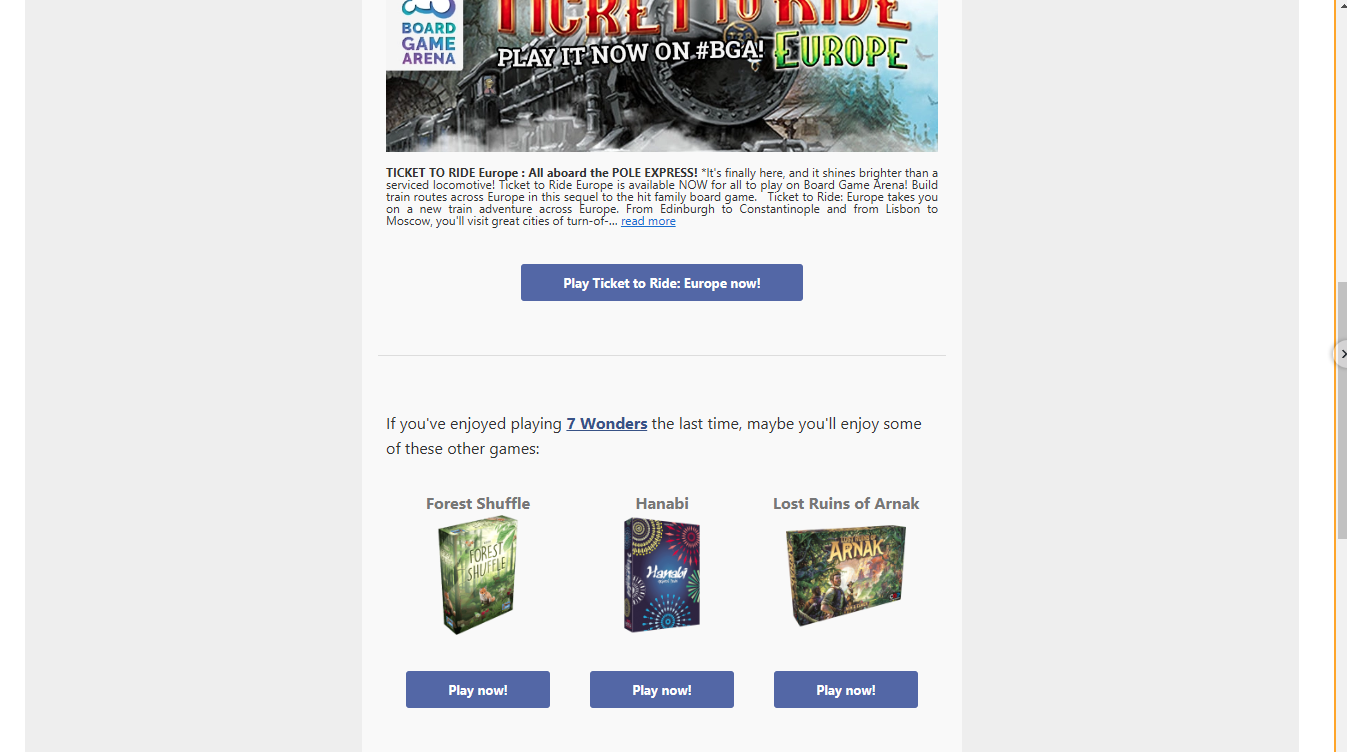
See how Board Game Arena placed its main CTA visually separate and larger than the three other CTAs? It even has a different copy.
If you have two CTAs close together, and one is the main one, make sure they are clearly distinguishable. For example, if you offer more than one service tier, make sure to visually separate them. Moreover, choose the option you think will have the greatest impact and use your brand’s colors (the ones you use on your website’s CTAs).
11. Make The CTA Instantly Visible
Now, when it comes to email, you need to understand that people are not prone to giving them too much time. They have to be straight to the point and provide all the necessary information immediately. Emails, especially sales emails, are not the place to give lengthy details. Depending on the target segment, they can be either sales or lead-generation tools. In both cases, users will skim your email at best, and only if they find your primary offer interesting will they read the rest.
To ensure all your information is instantly visible, place your CTA just before the fold. This way, the user will be able to see the three most important parts of your email—the branding (the header), the offer (the headline), and the solution (the CTA).
12. Focus On Low Commitment CTAs
When you put someone on the spot, they are often reluctant to agree, even if they need it and the offer seems good. So, instead of putting them on the spot, try changing your CTA to a low-commitment alternative.
In other words, instead of using “Buy Now,” go for “Learn more,” “Check it out,” or even “Browse our collection.”
These CTAs don’t require commitment and are not focused on finalizing the transaction. Thus, the email reader will be more comfortable clicking the button to learn more about the product and the offer.
13. Forget About Image CTAs
Finally, don’t embed CTAs in images. This will make A/B testing much harder, and each small change to the CTA will require a new design. This may sound like a small step that doesn’t really increase your overall CTR. However, A/B testing is essential in finding the best copy and CTA for your email. Making it easier on yourself will make improving your overall click-through rate much easier.
14. Never Prioritize Images Over Copy
While images are important and can draw attention, the copy is what will sell your product and drive up your CTR. So, you must find the delicate balance between the two.
Now, the urge to include as many images of your product as possible in the email is completely understandable. After all, you want your product front and center. However, image-heavy emails also load slowly, especially if the user’s internet connection is slow when they open them.
Moreover, while the images set the branding and overall vibe of the email, the text conveys the message. So, finding the right balance is key to enhancing your CTR.
15. Use Footer Effectively

Once you’re done with the CTA design, it’s time to pay some attention to the footer. This is where you will include most of the additional information that isn’t related to the current message. For example, you may add a preferences link where subscribers can provide zero-party information about what they want to receive. This is also where you will add other features that enhance your credibility: your business address, social media accounts, and, once again, your logo.
Still, you can also add other tokens to your brand culture. Some add a personal message. Others just add their slogan. It’s up to you. The best part is that the footer is at the bottom, after the CTA and the important information, so it doesn’t matter how long you make it, as long as it doesn’t get boring or distasteful.
16. Include Unsubscribe Link
The unsubscribe link is the most important link in your footer. This link lets your subscribers opt out of future messages from you. We understand why you might be reluctant to add such a button, but it is essential for complying with various regulations worldwide.
Regardless of the regulations, you also have a genuine interest in the unsubscribe button. You don’t need audience members who are not interested in what you have to offer. This will only dilute your stats and won’t give you a clear picture of your email’s success. So, instead of manually clearing your list, let it clear itself.
Most importantly, if your email doesn’t have the unsubscribe option, users will likely flag it as spam. This will be a massive blow to your overall email marketing campaign. When enough people flag you, email providers automatically send your emails to spam.
Still, you can make an effort to mask the unsubscribe button with a bit more discreet wording. Check out what Booking’s unsubscribe button looks like:
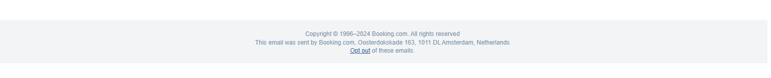
Sure, their Footer is definitely not the best, but the choice of copy for the unsubscribe link is simply gold.
So, while the unsubscribe button doesn’t help increase your CTR, it helps it remain intact.
16. A/B Testing Is The Key
Finally, once your email is ready, it’s time to test it. Now, keep in mind that there are no design patterns that are set in stone. There are many minor tweaks you can make to better your performance. For example, some vendors add social proof from third-party websites in their emails. They often do it in the body of the email, and it works pretty well. What you add to your email depends on your industry, niche, and, most of all, the type of email.
Now, you might wonder, “How do you know it will work?” You don’t. Actually, you need to gather data to determine which option is best for your particular case and audience. So, this is where A/B testing comes around.
Now, when you’re doing an A/B test, you can check on anything. You can even test two completely different designs. As long as you have a clear goal of what you want to learn, there are no wrong A/B tests. However, make sure the results are conclusive before you scrap one of the solutions.
As you can guess, finding a design that clicks with your audience will instantly skyrocket your performance stats. So, while everything on this list is pretty much tried and tested, before you try it on your own product, you can never be confident that there isn’t a better solution.
Performance Checklist for Email Design
A well-designed email should look great and load quickly across all devices and email clients. Use this checklist to avoid common issues that can negatively impact click-through rates.
- Limit image file sizes to reduce load time
Compress images and avoid unnecessarily large files to ensure fast loading, especially on mobile networks. - Avoid autoplay GIFs or excessive animation
Subtle animation can enhance engagement, but too much movement can distract readers and increase load times. - Ensure CTA buttons are readable on mobile
Buttons should be large enough to tap easily, with clear text and sufficient spacing from other elements. - Test contrast ratios for accessibility
Use high-contrast text and buttons to ensure readability for all users, including those with visual impairments. - Preview emails in both dark and light modes
Some colors and images may appear broken or lose visibility in dark mode, so testing both is essential. - Keep total email width under 600px
This ensures consistent rendering across most email clients and improves overall readability.
What’s Next?
With a higher CTR, you will see far more visitors to your website. So, make sure your hosting infrastructure can handle it all. In fact, one of the biggest problems in email marketing is that the website is not ready to take on the surge of visits during the campaign. As you will be sending hundreds (if not thousands) of emails simultaneously, people will reach your website in a very short period. This will put your servers to the test, and they will often crash under the weight.
Well, not if you use HostArmada as your hosting provider. Our cloud-based infrastructure guarantees your website will be online 99.9% of the time. Moreover, our generous buffers will ensure all your visitors will enjoy lightning-fast loading times and zero lag.
If you’re not among the lucky website owners who already have HostArmada hosting, check out our plans and choose the one that best suits your needs.
FAQs
Email CTR (click-through rate) measures how many recipients click on links within an email. Design affects CTR by improving readability, guiding attention, and making calls to action easier to notice and interact with.
Email design improves CTR by using clear layouts, strong visual hierarchy, concise content blocks, and well-placed CTA buttons. Mobile-friendly design and fast-loading visuals also play a key role.
The most important elements include a scannable layout, readable fonts, high-contrast CTA buttons, optimized images, and a responsive design that works well across all devices and email clients.
Yes, mobile email design has a major impact on CTR since many users open emails on smartphones. Emails that are easy to read, tap, and navigate on mobile devices typically achieve higher engagement and click-through rates.