Tips / Saturday May 16, 2026
How to Structure a Landing Page for Conversions

Content is the single most important part of digital marketing. Without it, the entire infrastructure, A high-converting landing page should be structured around one clear goal: getting visitors to take action. Whether the objective is generating leads, promoting a product, or increasing sales, every section of the page should guide users toward a single CTA. The most effective landing pages usually include a strong hero section, problem-and-solution messaging, offer details, benefits, social proof, pricing information when relevant, and a clear call to action. A well-structured page also improves user experience by making information easier to scan and understand.
In this guide, we’ll explain the essential sections every landing page should include, the differences between common landing page types, and how to structure your content for better conversions.
What Are the Different Types of Content?
Before we go in-depth, discussing how it’s best to transform your regular readers into loyal customers and leads, we first need to get some terminology out of the way.
If you open any website, you will find at least several types of content inside. Depending on the purpose of the browsed landing page, you may find some or all of these content types. There are five basic types of content: Web Copy, Content, Images, Video, and Infographics. We discussed them in more detail in our previous article, so if you want to learn more about them, don’t hesitate to read it first. What you need to remember is that:
- Web Copy is the body of your website, which is short and to the point. It aims to convince your audience to take a predetermined action and is mainly a sales tool.
- Content is what you will find in the blog section of most websites. The main idea behind the content is to educate, entertain, and give instructions. It’s mainly used as a traffic source and greatly helps your SEO efforts.
- Images, as the name suggests, represent visual content, aiming to relay as much information in as short a time as possible. The point is that people often are reluctant to read, so you need to visualize your content.
- Video is once again a visual content solution that aims to help the audience digest complex information more easily.
- Infographics are the perfect combination of visual and written content. They are perfect for relaying statistical and fixed data, but not so much for conveying emotions and perceptions.
Naturally, which of these content types you’d prefer to use depends on your agenda and your landing page. But before we discuss how you should build your landing page, let’s learn what a landing page is.
So, What Is a Landing Page?
In digital marketing terms, a landing page is a stand-alone page explicitly created for a marketing campaign. While it does need to follow all SEO best practices, SEO is not the main point behind the landing page, as typically, those are used for paid campaigns. The main difference between a landing page and a website is that the landing page aims to end in a conversion. This means that the whole point of the page is not to explore or to inspire interest in the reader but to persuade them to buy a specific product or service. The landing page makes it easier to track the progress and success of a marketing campaign.
There are two main types of landing pages :
Click Through Landing Pages
These are typically used by eCommerce businesses and other services offered to the end client. The predetermined action in those campaigns is most often related to a service subscription or a purchase.
Lead Generation Landing Pages
Also known as “Lead gen”, these landing pages have a different goal than traditional click-through landing pages. They typically aim to collect the lead’s information like name, email address, or telephone. After that, the sales team contacts the lead and offers them the product or service directly.
Which One Should You Choose?
It depends on your strengths and weaknesses as a company. Typically, if you have fixed prices on predetermined products and services, and especially if you are a B2C business, then you should probably go with a click-through landing page. However, if your clients are other companies and the prices of your product and services depend on the workload and the order details, then a lead gen landing page is the best.
What Are the Components of a Landing Page?
Each landing page is unique on its own. It’s based on what you want to communicate with your audience and whether it’s lead gen or clickthrough. Nevertheless, it would help if you could imagine the page’s content as a funnel. Funnels are quite the theme when it comes to marketing, and creating your content around the same vision is not a bad idea.
Imagine the link that leads to your landing page as the entry to the funnel and the check-out page as the exit. Everything in between should make sure to push the lead gently toward the exit of the funnel. Your landing page, in practice, has to have only two mandatory elements – a Headline and a CTA. But let’s have a more in-depth look at all landing page elements you might want to add.
The Hero Section
The hero section, otherwise known as the header, should be the beginning of a story you’d like to tell your audience. One that will persuade them to continue reading or click on the CTA immediately.
Headline
In practice, this is the headline of your landing page, and naturally, the header should be tagged as H1 in your metadata. The headline should be no longer than 70 characters, including spaces, as otherwise, most platforms will cut it. Of course, you can always make your meta tag different from your actual headline, but that will get penalized by Google and other search engines. So, you’d better stick to the 70-character limit, and you won’t have problems.
The headline should be punchy but straight to the point. You would like to represent what your brand stands for, what the offered product does, and how it would help your clients.
Subheading
In between, you may put a subheading, which should be tagged as H3. It should be dedicated to the problem our product or service resolves.
Place your text either on the left or in the center. Avoid placing it on the right, as most people (in the Western world) tend to read from left to right, and they instinctively look first at the top left corner of the screen. So naturally, that’s where you need to place your most important information. Note that this may vary depending on the language. For example, in Arabic, the text should be placed to the right, as they write from right to left.
CTA (button or link)
Under the headline (or subheading, should you decide to use such), you need to put a CTA. We will explain the CTA button a bit later, but for now, it should be short, proactive, and depending on your audience, you may consider putting it in the first person (e.g., “I’m interested”, “I want it”, or “Count me in”.
Image, Animation, or a Video
It’s a good idea to garnish your Hero section with an image, animation, or video. Make sure the image either represents a satisfied customer or gives a graphical justification for your product. The point is for your target audience to recognize itself in that image or to recognize the solution your product offers to their issue.
Industry
This section is a good idea if you offer a B2B product or service. However, typically, end clients are not that much interested in the industry you are in and the trends behind your product, so you can skip this one if you are dealing with end clients.
The Industry section should consist of statistical data and industry trends. Since one campaign rarely lasts more than a month, the trends won’t change all that much during that time. The point of mentioning the industry is to show you are familiar with the market, on the one hand, and, on the other, to shift your narrative from the collective (the whole industry) to your company. Your goal is to present your relationship to the market and explain why your product or service will give you an edge over the statistical average.
Problem/Solution
This section is highly recommended for both B2B and B2C landing pages, as well as both Lead Gen and Clickthrough landing pages. Each winning product solves a problem the client has. This is the part where you illustrate that problem. Visual content here is incredibly effective, as people can more easily recognize themselves in the representations. Naturally, after you lay out the problem, you can explain your solution.
Typically, the H2 headline for this section should mention both the problem and the solution. The body should consist of two paragraphs of equal size. The first one will talk about the problem, and the second one will talk about the solutions. Each paragraph should be no more than 150 words long. Remember, people don’t like to read. Depending on your targeted audience, you can go with the video, images, or even comics. It’s all up to you. Still, make sure this part is short and sweet. The main point of this section is to spike their interest in what you offer.

The Offer Description
After you discuss the problem and the potential solution, it’s time to give the offer. In this section, you will explain why your product will help the leads resolve their problem. Be sure to keep your target audience in mind and write for them, not for yourself.
One common example is using highly professional language for products or services meant to help people, precisely because they are not professionals. Often, SaaS companies are perpetrators of that sin, as they often use abbreviations that say nothing to the average person.
Also, don’t focus on how the product is made, but on how the idea sprang, why you decided to make it, and what is unique about it. In short, you need to explain why the reader has to choose your product over others. As a general rule, use a simple yet professional-sounding voice. Avoid abbreviations except when widely known to the public (e.g., SaaS). Furthermore, write about the product as if you are answering your customers’ questions. Finally, use bullet points to highlight the main features of the product/service, and keep the text to 200 words max.

About Us
Treat this section as a resume you’d give any employer when you are looking for a job. Keep it short (about 150-200 words) and to the point, highlight your team and your experience, speak predominantly in numbers, and don’t hesitate to mention your successes. Also, put some references if you have any. For example, if you work with a particular company, ask them if it would be OK to put their logo on your website as a reference. Most will gladly agree, as this would be a massive bonus for their SEO.
Start the section by presenting yourself, how long you have been on the market, whether you have any other best-sellers (products or services), and who you are working with. Then, tell the audience about your successes with numbers and finish strong with your company’s mission and goals.
If you have the history and resources, you can even create an infographic with your timeline.
Authority Proof
This is one of the shorter sections, which would preferably be only with images. Here you’d want to put all your awards and relevant certificates issued by authority figures. This includes certificates of quality, high-profile partners, and your score from review-centered websites like TripAdvisor, Google, and others. However, don’t place a 120-page-long document. Just the title page or the logo of the organization that endorsed you is enough here. The point of this section is to give you some credibility based on the fact that institutions or other authority figures in your industry have recognized you as part of them. This brings peace of mind to the leads that you are not a scammer, and you have at least some quality to your product or service.

Benefits
The benefits are one of the most important components of your landing page. After all, the customer would like to know what your product or service offers on top of other choices. There are several tactics you can apply here, and there is no single correct answer. You can go with vectors and numbers, with H3 subheadings and small paragraphs, or a comparison with other similar products. It all depends on your audience and its preferences. Make sure you add every benefit you offer with your product/service, whether emotional, physical, or monetary.

Social Proof
Social Proof is another section that highlights your authenticity and high quality. It usually consists of testimonials, but can also include articles about you in high-profile media outlets. If you have the budget, paying a high-profile news outlet to write a piece about you or your product will definitely be beneficial. But that’s more aligned with your marketing strategy and not your content.
Usually, this section contains testimonials. Make sure the testimonials are genuine and positive, all given by real clients. Don’t allow any criticism to appear on your landing page. The main idea is not to inform but to sell. Therefore, you need to hype your product. So, find the best reviews of your product and ask the posters if they are OK with publishing their photo and name. Having names and pictures is essential, as they will inspire confidence in your services. If you are a B2B-oriented company, add the client’s logo and name. Each testimonial should be 2-3 sentences long and focus on your product’s selling point.

Prices
This section is definitely not a must, especially if your prices depend on several factors. For example, if you are going with a lead gen landing page, a prices or rates section is not the best idea, as the landing page is not the sales tool in your marketing strategy. On the other hand, if you insist on placing a price list as a filter for people who won’t be ready to pay the price, you should go with the “from” version. For example, “Prices start from $200.”
If you are using a click-through landing page, the price is a must. This is the final place your customer will visit before transferring the money. Well, except for the Check-out page, but it’s not a good idea to leave them clueless about what they would have to pay until then.
If you are offering a product, naturally, it will have one fixed price, but if you are offering a service, it may have various upgrades or plans. So you’d want to add a price table. There are a ton of beautiful price tables out there, and if you are using WordPress, countless plugins can help you create a unique one that will align perfectly with your entire website and brand image.
No matter how you represent the price, make sure it’s as clear as a cloudless day. Be very careful in how you formulate the price, as in some states and other countries, you might be legally obliged to follow your pricelist (if you have one) strictly.
CTA (Call to action)
Finally, we are at the bottom of the Landing page, which means it’s time to persuade the audience to take action. Every marketer will tell you that you should never leave your potential customer wondering what they must do. You need to tell them clearly and directly what action they should take. The CTA section should include an H2 subheading, a short text of up to 150 characters, and an action button that clearly states it is the action button. Note that the H2 subheading should never start with a negative word (e.g., Don’t, Never, Forget, etc.) In some rare cases, you can experiment with a positive-negative, which sounds ridiculous, but it may have the desired effect. A good positive-negative is “Don’t tell me you’ll miss on that offer.”
Naturally, the CTA section needs to be short and to the point. But more importantly, it should be the logical conclusion of the entire narrative you’ve been creating on the landing page by that point.
The CTA section should convey the overall emotion of the narrative so far, as well as some urgency and the sense that the customer may miss out if he decides to prolong. It should also once again highlight the main solution that is offered and, if possible, the main benefits.
If you are going with a lead gen landing page, this is where you’d want to place your contact form. Make sure all fields are clear, and no one will ever hesitate about what needs to be entered in any field. Naturally, if you are going for a click-through landing page, you should go directly to the action button.
The Call to Action button should be marked as such. It must have a short, punchy label, such as “Buy now”, “Join in”, or “Sign up”. Some marketers claim that going for a button CTA in the first person (e.g., “I’m in”) will grab more attention, but personally, we’d test this claim before trusting it 100%. Whether such a thing works depends on the audience and the narrative you created throughout your landing page.
Creating a good CTA section is not easy. However, here is where the copywriting genius truly shines. Needless to say, the CTA section is the most important one on your entire page.
So, How to Structure Your Landing Page?
Which of these sections and components you should add depends on many factors, which include but are not limited to:
- Your audience type.
- Your product or service.
- The information you are willing to give.
- How well-known are you on the market?
- Are you an authority in your industry?
- Do you have high-profile clients?
Moreover, if you are a good copywriter, you can combine some of these sections into one. This way, you can make your landing page even shorter and sweeter.
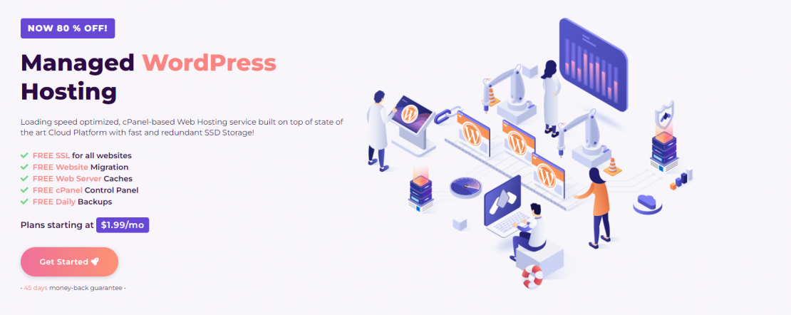
One thing that you definitely must have is a reliable and well-maintained website. Whether you go for a clickthrough or a lead-gen landing page, your website should be able to show the page instantly and preferably have as little downtime as possible. Keep in mind that if your product or service goes viral, you will have a surge in traffic, which may lead to server crashes.
That’s why you need a reliable hosting service provider. Luckily, HostArmada is just what you’ve been looking for all that time. Our hosting is fast, secure, and stable, bringing your downtime to practically 0. So check out our offers, and don’t hesitate to contact us if you need any help in choosing the best plan for you.
FAQs
A landing page should include a clear headline, hero section, benefits, problem-and-solution messaging, social proof, trust signals, and a strong CTA.
A homepage serves multiple purposes and links to different areas of a website, while a landing page focuses on a single goal or conversion action.
The ideal landing page length depends on the offer and audience, but the content should stay concise, easy to scan, and focused on conversions.
The headline and CTA are the most important elements because they communicate the offer and encourage visitors to take action quickly.